Eric Peacock — Media Design, Motion Graphics & Video Editing

Bonus Portfolio

I mostly work with video and motion graphics, but I also have an extensive background in graphic and web design.

This work-in-progress page provides a quick overview of my design work in other mediums, both old and new…


Design Style

I frequently collaborate, but what about when I need to come up with a design independently? Here are some examples to help convey my general style…

Fever Dreams Sleep Hygiene Comix modified illustration for Sleep Foundation video
Graphic created for the Fever Dreams edit I did for the Sleep Foundation YouTube channel. A last-minute add to cover a cut and drop a-bit-of fun in the video itself, but with some tweaks it could double as the ever-important video thumbnail. The woman illustration is adapted and re-colored from stock, and I added the comic-book-style typography and layout.
Layout & logo concept for a sub-branded motion-graphics package built procedurally from different typeface weights. The project's producer preferred this, but the client wanted "just a font" for the final version.
Retro-themed campaign design. I was inspired by photos of seventies vans with racing stripes!
Call-to-action button design for centered layouts Call-to-action button design for left or right aligned layouts
The call-to-action buttons I designed for this campaign are a personal favorite.
What is it? One of several conceptual UI explorations for an interactive story-driven entertainment product that unfortunately never shipped. The creative director saw one my abstract album covers and wanted to experiment with that style. I love trying something new and challenging, so I gave it a shot. This was an interesting diversion from my usual UI work that emphasizes clear communication and accessibility.
Marrow Robert poster design Marrow Francis poster design Marrow Cinequest Family poster design

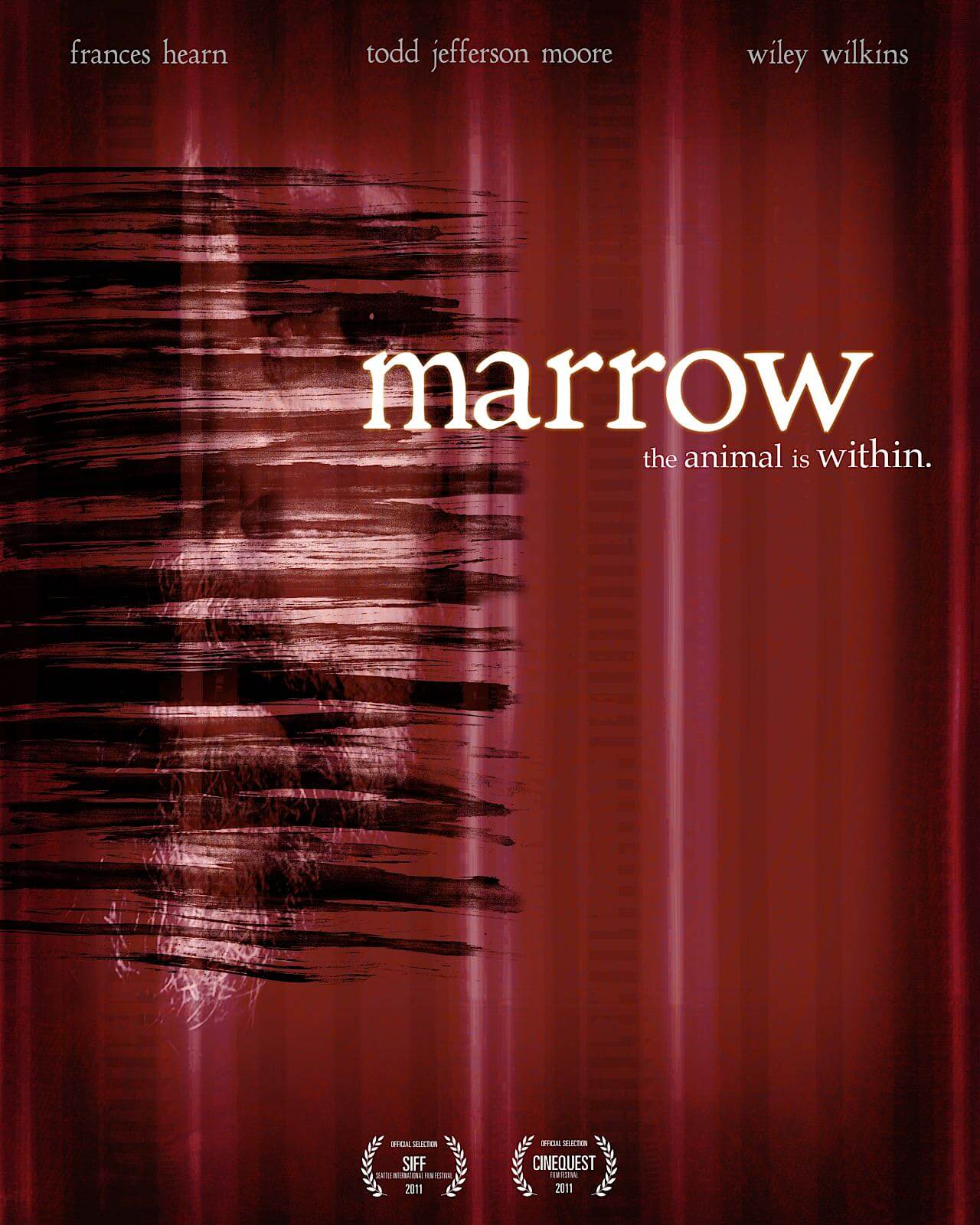
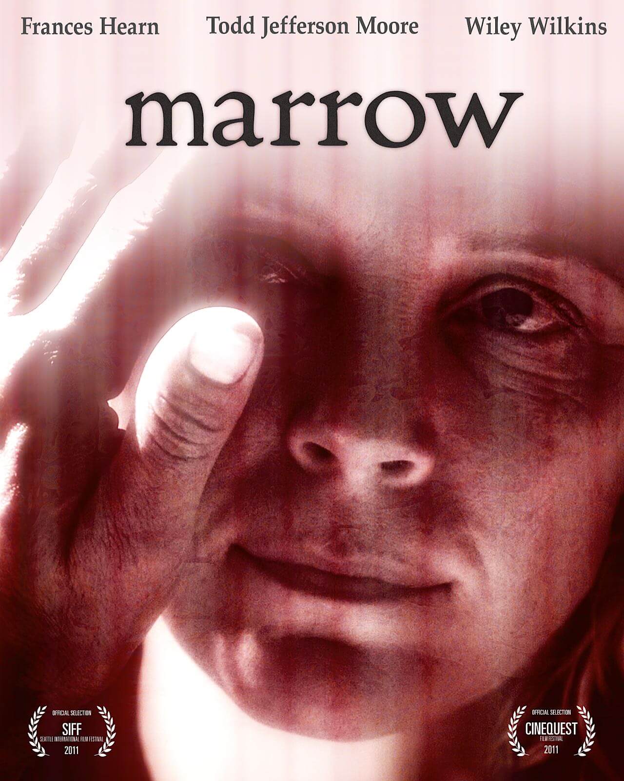
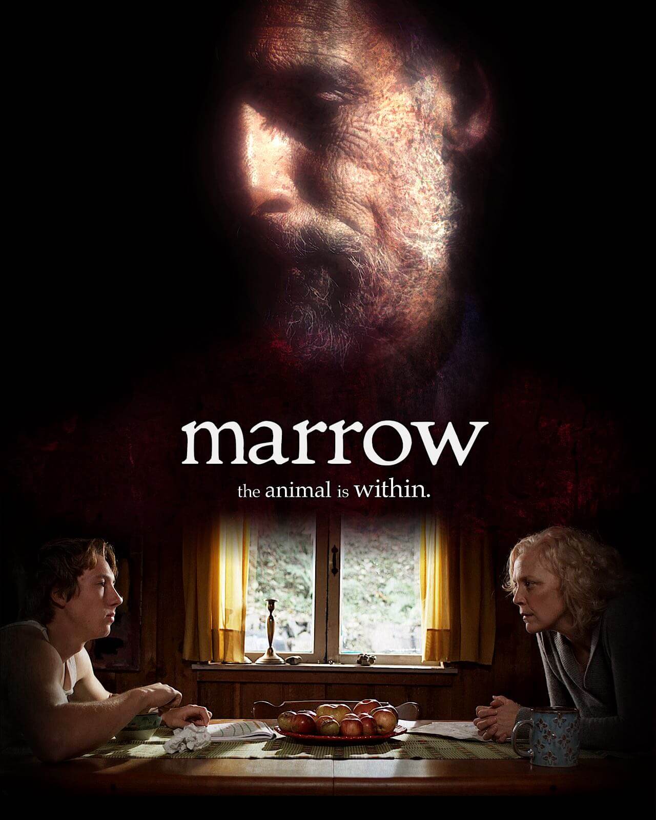
Poster designs for an independent feature film on the festival circuit; One design for each of the principal characters, with the last one featuring all three of the core cast. These were based on an overall branding I came up with for the promotional web site.

“You really should show the design you did for your wedding in your portfolio”: Er… OK! A long time ago I made a video-based invitation and other branded materials for my wedding. The video was sent out on a custom DVD and featured interviews with friends (who were also working actors). We had them talk candidly about our relationship, make jokes, and generally have fun. The video featured all sorts of original art and motion graphics I created.

3D

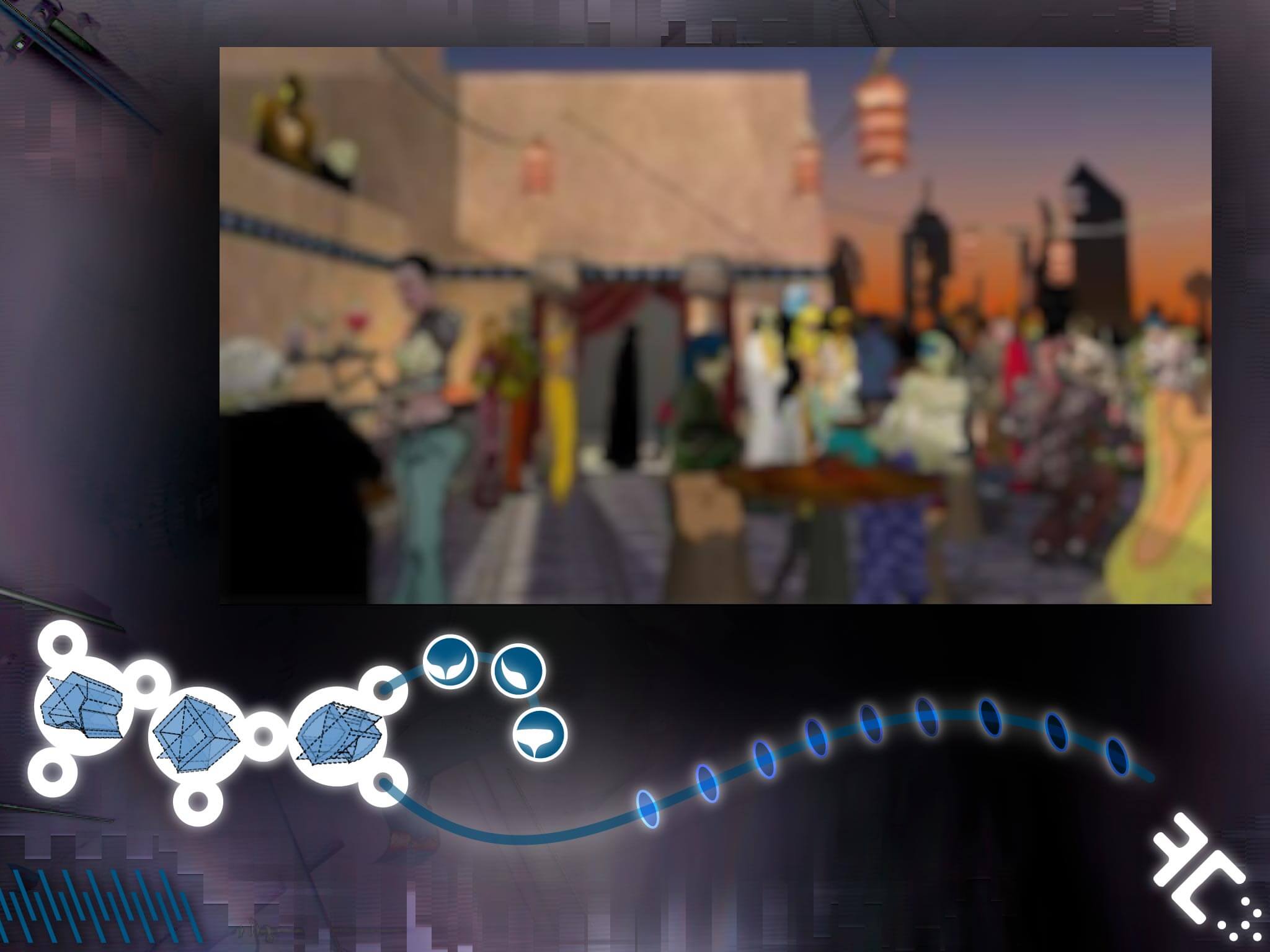
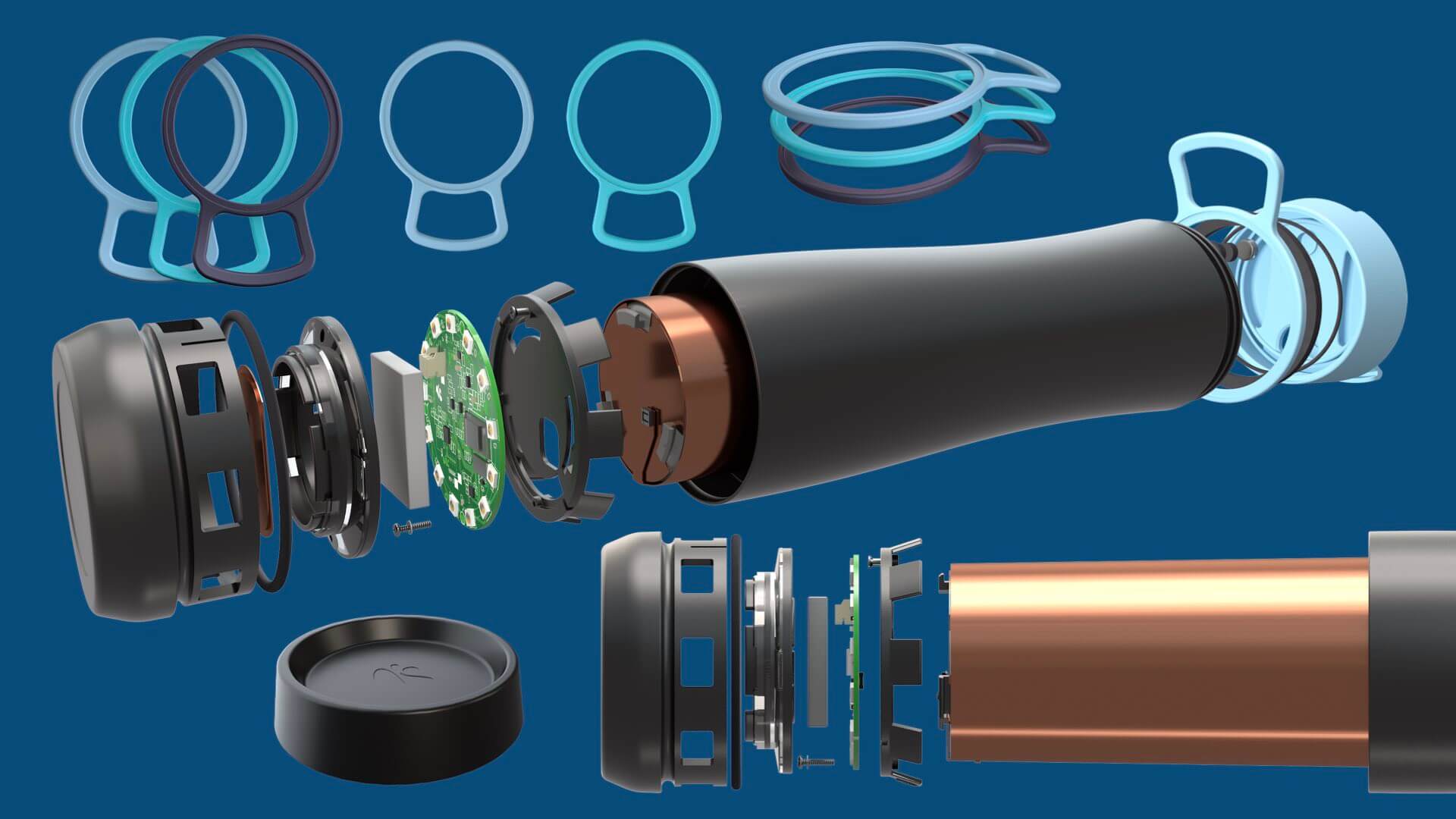
I've worked in all kinds of 3D software. I love having unprecedented control of light and geometry as an infinite creative canvas.

I mostly work with Maxon's Cinema 4D; It's powerful, designer-friendly thanks to procedural tools, and has handy integration with After Effects or Illustrator. I've also been getting into Blender.

I like to use 3D as a means of custom illustration or stylized looks but if necessary I also work with photorealism. I'm definitely a 3D "generalist" having touched on everything from modeling, custom shader design, to lighting (HDRI or "manually").

Custom wooden varnished look for a brand video 3D logo treatment adapted from existing vector logo.
Stylized render featuring a customized model with branded shaders.
Example 3D renderered product prototypes for Aquagenie Corporation.
Examples of product prototype renders for a startup. I converted, textured, and lit these from the product designer's CAD source.
There's more: Here's how the above renders appear in a pitch deck slide I also re-designed (view original slide in new window).
I directed and animated a spot featuring this robot mascot. These are various renders with matching props for the associated print and online media launch campaign. The brand has a strong white-on-white look-and-feel which makes lighting and compositing more complex. The shaders I created are based on the reflectivity of car paint.
3D for stylized output: I designed this scene to be post-processed with a custom brand-specific watercolor treatment for this animation. I modeled and textured the school bus from scratch using loft splines and booleans because stock models were too realistic for this execution.

Retail Design

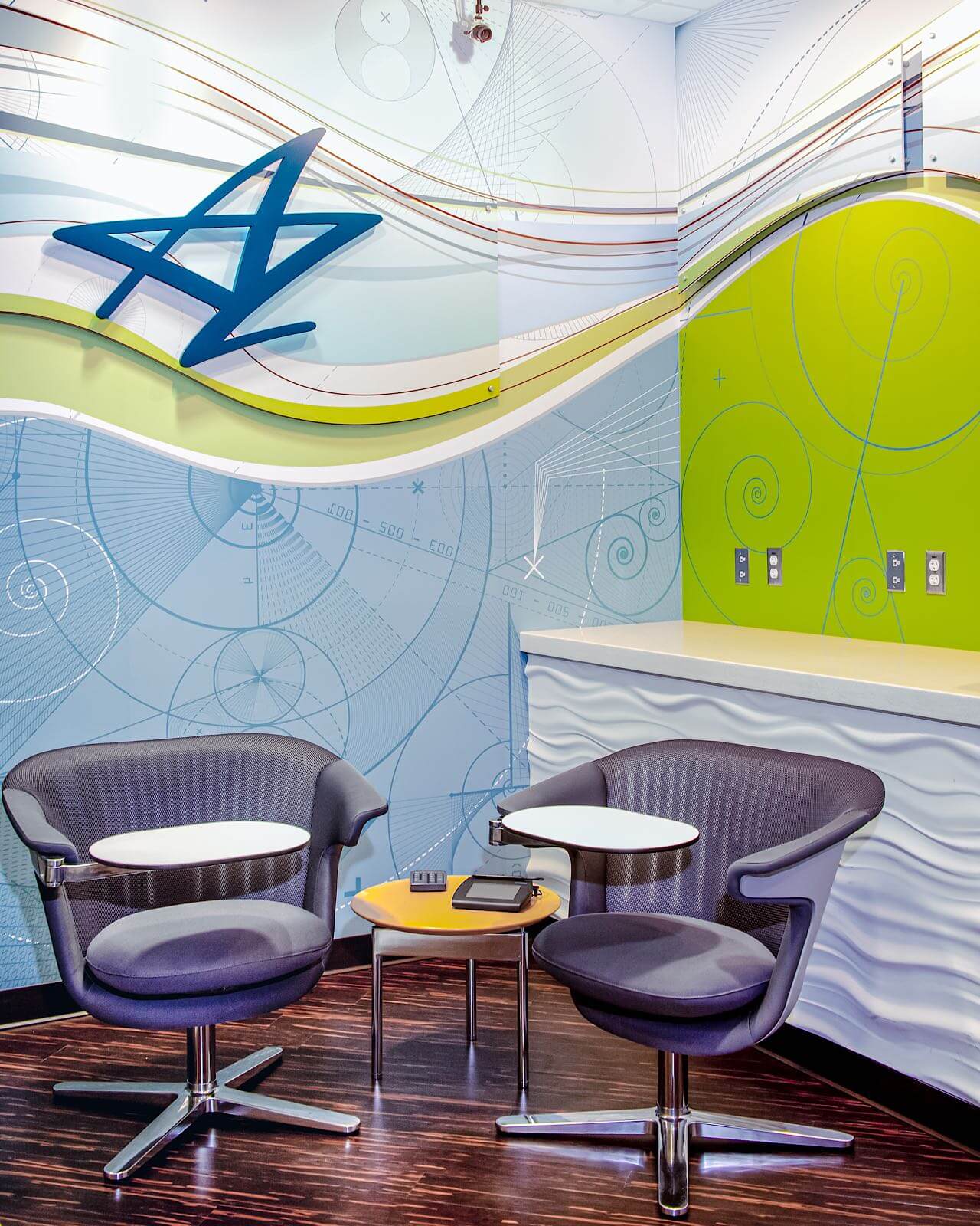
I created original illustration, design, and layout for the following retail spaces. I also did all the production work prior to handing files over to large-format print vendors for fabrication. Additional direction, copywriting, and interior design were handled by the fine folks at Strum Agency.
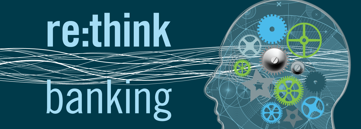

Re:Think Banking

This tiny retail financial branch was concepted, designed, and produced under a tight three-week timeline that included getting all materials printed and fabricated at external vendors. Working with an interior designer and architectural firm I designed the artwork/illustration exactly for the space.

During the design and production phase the architectural plan changed several times, which required making the artwork/illustration as a modular series of parts that allowed for shifting dimensions and orientations.
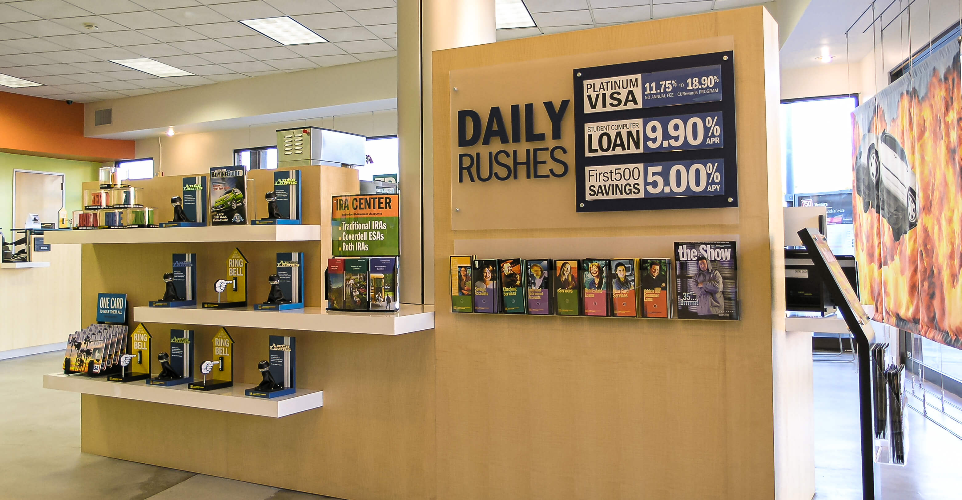
Elevation of the complete wraparound wallpaper design, including mocked-up plexiglass standoff panels.
Showing my work: here's an alternate wallpaper design I explored in the concept phase. I generated the background art from photographs of local geology using various vectorization techniques.
A variation of the "head" art used for the backlit ATM header.

Hollywood Type

I designed this retail merchandising program for a Hollywood-based financial institution that serves movie and television industry professionals.

Most of the weights in the Franklin Gothic typeface family were used for copy-heavy displays printed on translucent acrylic — the most kerning I've ever done on a single project.
Type-driven dimensional hanging double-sided retail window display.
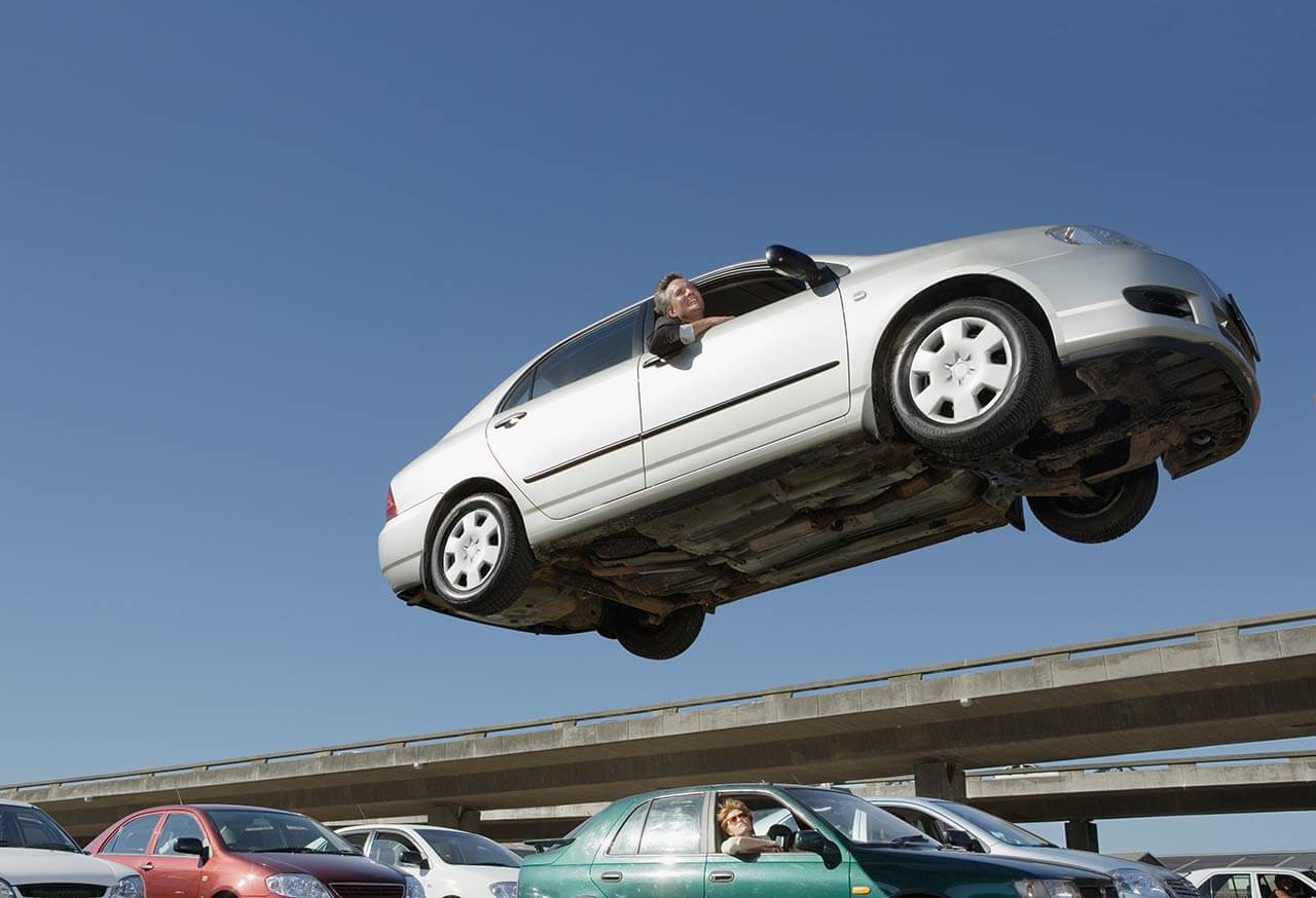
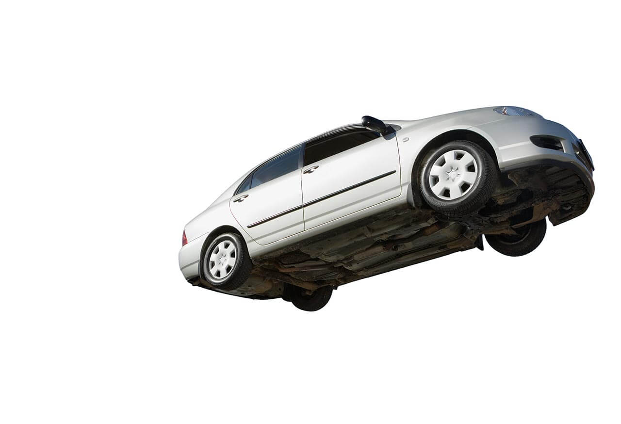
Behind-the-Scenes Anecdote

Due to its unique stunt context, the stock photo of the car is an expensive rights-managed asset. Ironically I had to significantly retouch the photo, removing much of what made it so expensive.

Original licensed stock photo Retouched photo with driver and background removed
Type-driven design for Retail signage and displays.
Custom themed artwork for retail greeter, intentionally riffing on a certain famous Hollywood landmark that doesn't allow rights for reproduction. The dimensional lettering is manufactured from proportionally rendered 3D paths and the background artwork was built from a composite of 3D rendered hillside and custom textures.

Web/Front-End Design

Though I've been focused on design, video, and animation since I was a kid, along the way I picked up HTML, CSS, and some JavaScript. My web design and development experience has come up in more non-web projects than I could have ever imagined.


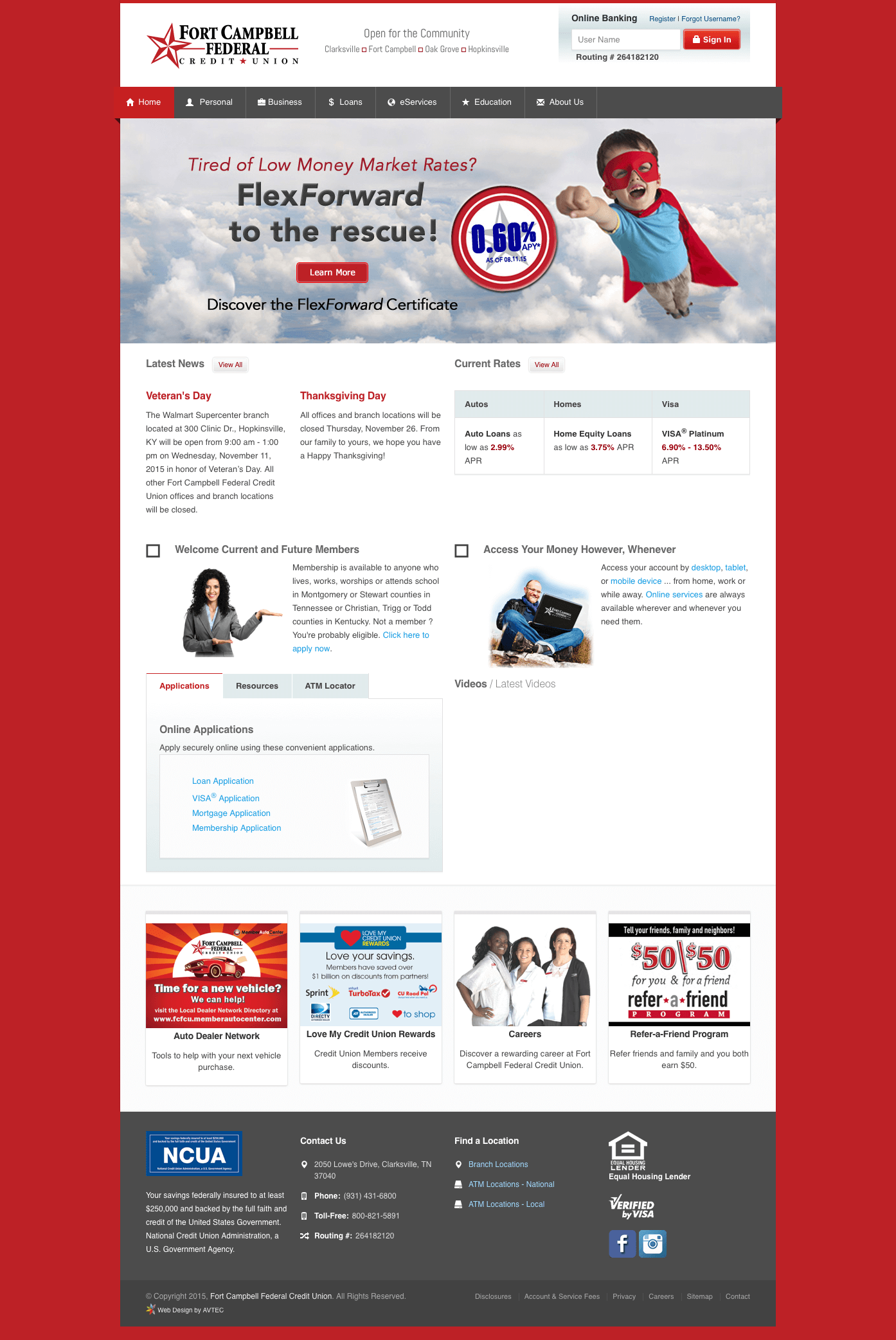
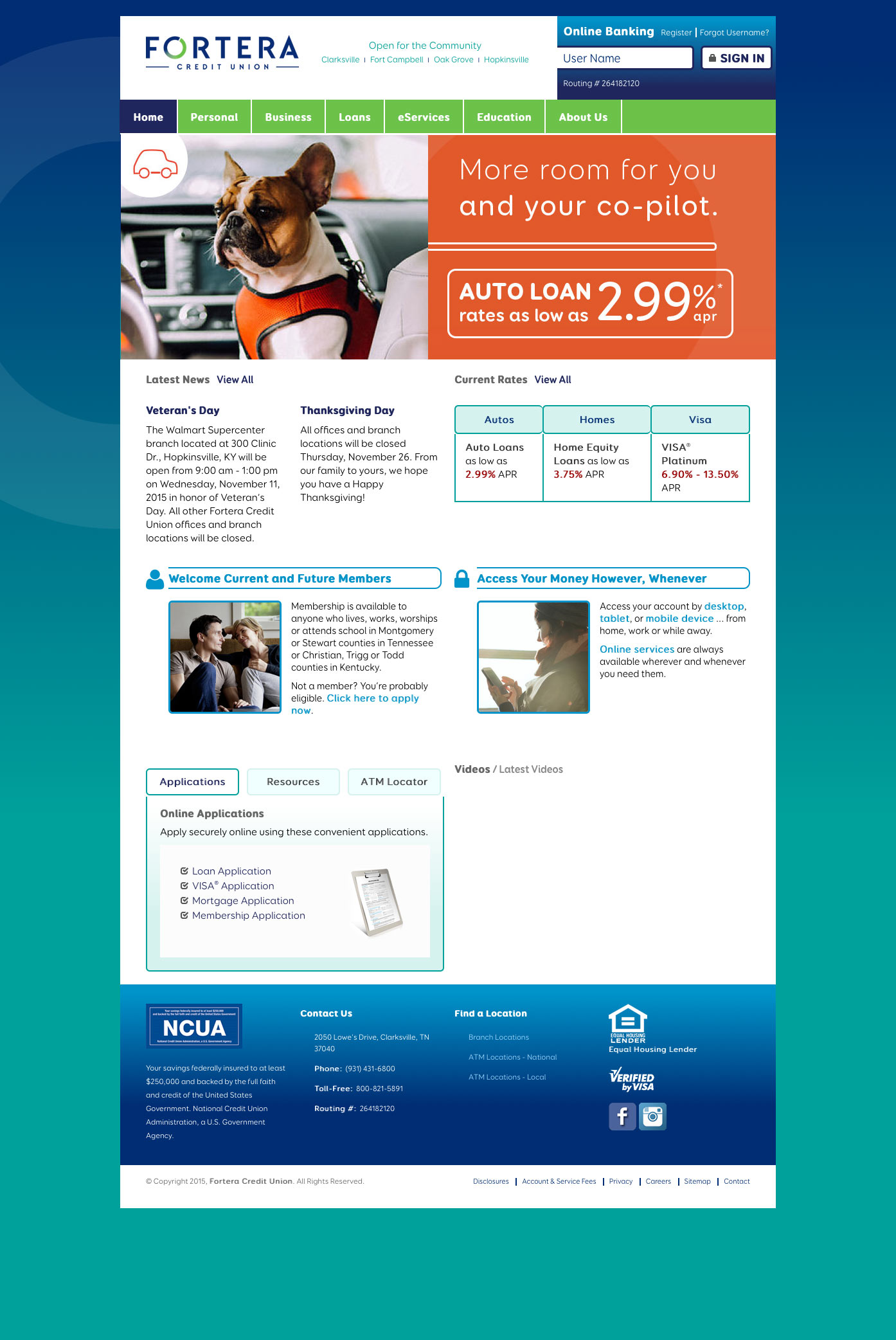
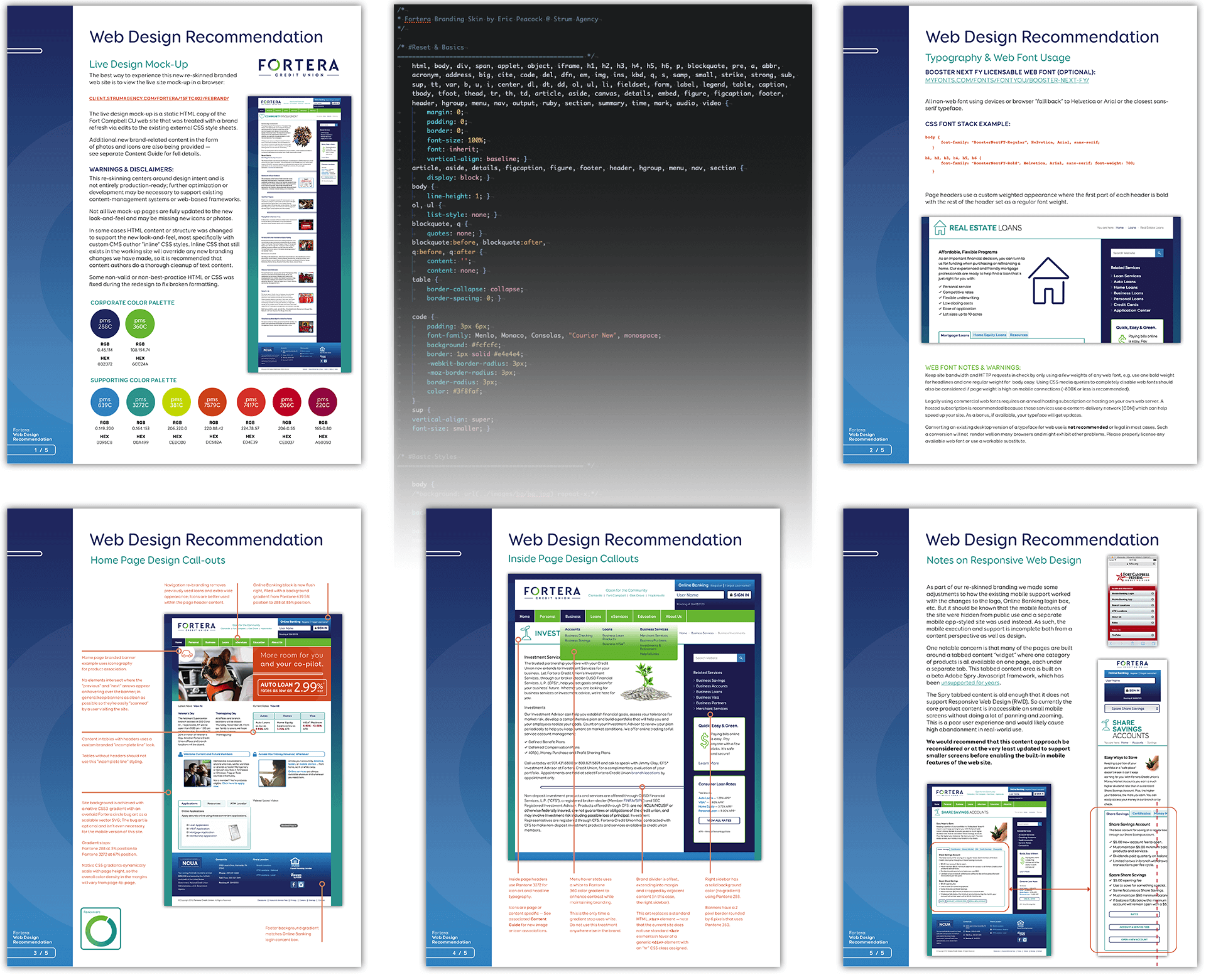
Web Site Re-brand: Same Markup, New Coat of Paint

This web site re-brand was done without altering the existing HTML markup generated by the existing content management system.

I reverse-engineered and re-wrote the site's Cascading Stylesheet to apply more than just a new coat of paint; This is an efficient and often underused method for designing for any web site. It took roughly three working days to fully adapt the rebranded design guidelines to a working CSS prototype.

It should be noted that this was a transitional design to accommodate a re-branding while the site's CMS markup was properly adapted for a "mobile-first" re-write.

Move the slider below to compare the rebranded CSS "skin" with the original.

Original
Redesign
Five page web design recommenation I wrote and designed
Documentation is important: Once the design was approved I wrote and designed a five-page site-specific brand guideline to accompany the updated CSS hand-off to site developers.

Branded Inbox Automation

Onboarding email series I designed and coded for a small financial client. The whole series is built on top of a fully responsive HTML email framework I customized for client use in Campaign Monitor's CMS.

The client was able to drag and drop custom branded layout modules as needed, make content edits or add new copy, and populate specific regions with content arrays linked to live recipient segment data. The entire series was automated to trigger whenever a new customer was onboarded and opted in to receive feature-based emails.

I designed these to match the client's existing brand while bringing a little something new, especially with the abundance of content making these "busy".

I adapted an existing icon library to generate new original icons for this series — financial-industry themes are not well-represented with stock icon libraries; It's a common necessity to create new illustrations to match an existing series.


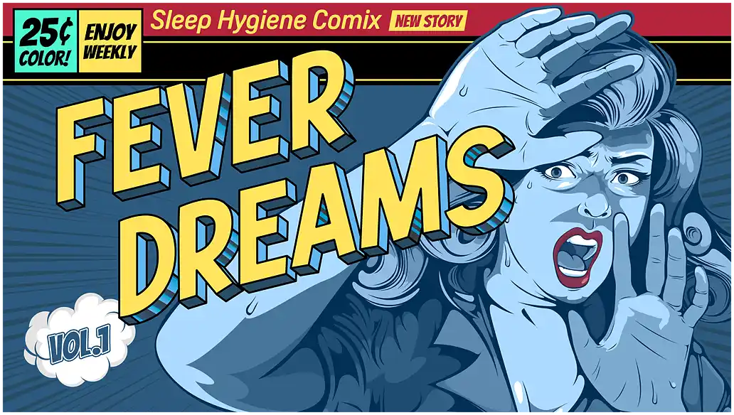
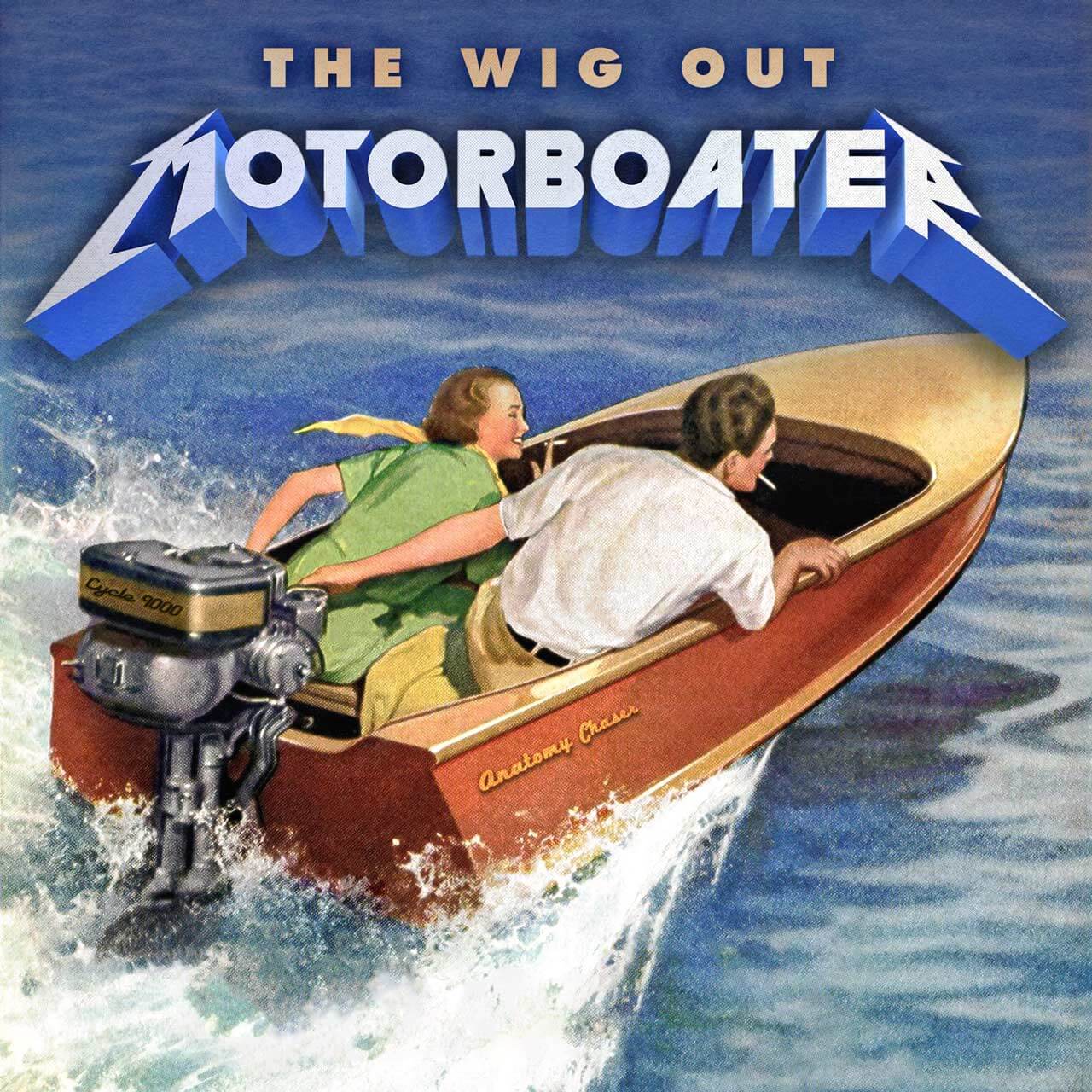
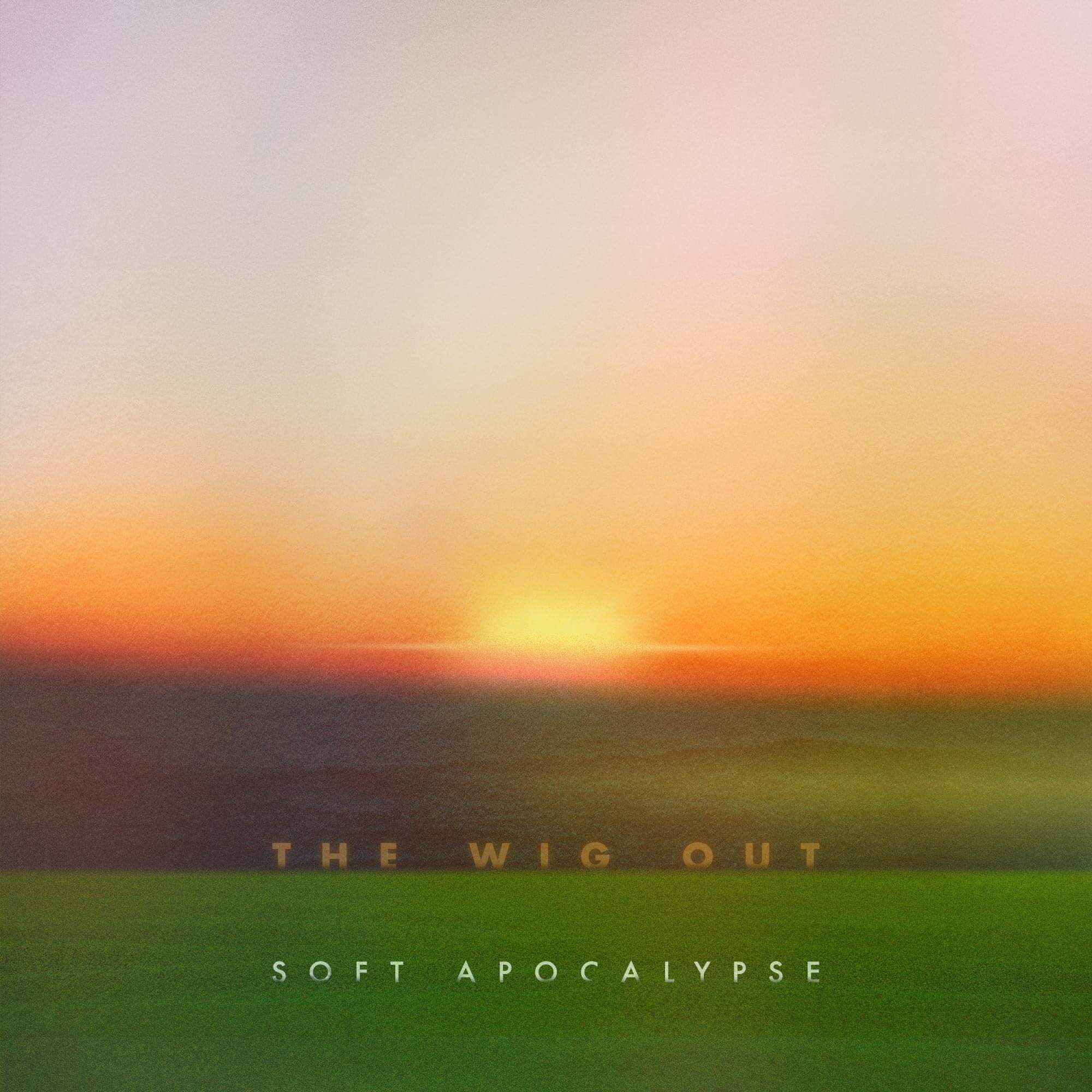
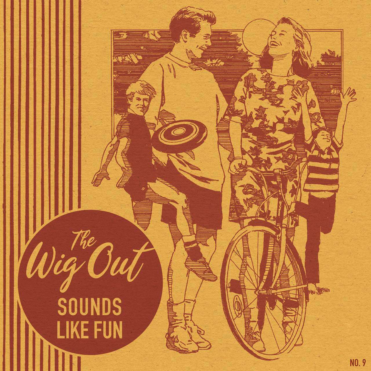
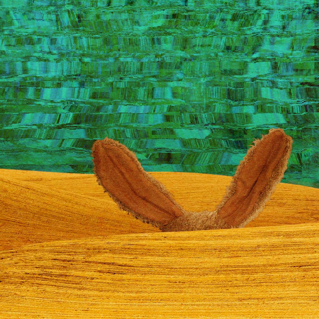
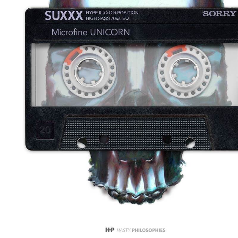
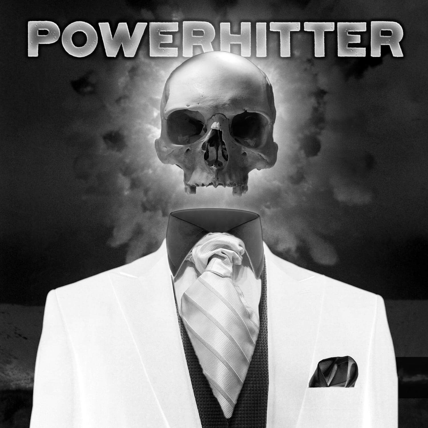
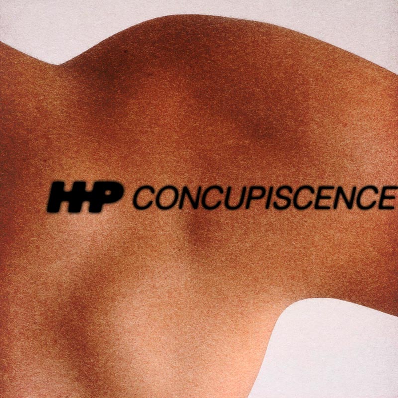
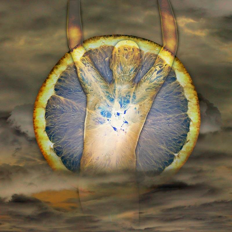
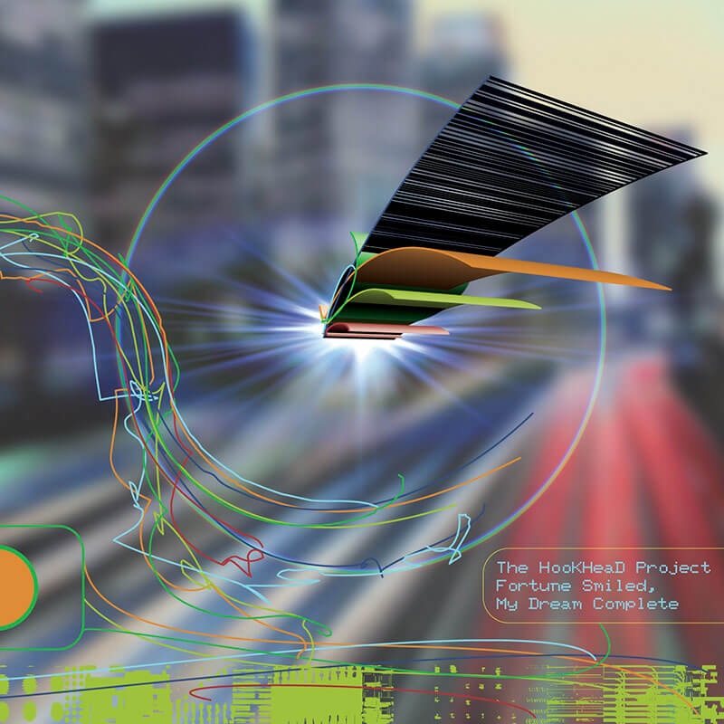
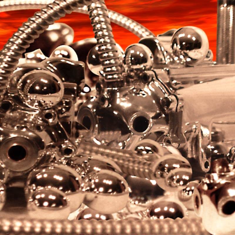
Album Cover Illustration & Design

I created most of these from concept-to-design, in some cases including design of the physical packaging. These feature a varied mix of original illustration, photography, or digital artwork — while others utilize appropriated imagery from the public domain.

The Wig Out - Motorboater single cover artwork
The Wig Out - Sounds Like Fun cover artwork
The Wig Out - Keep Your Joy A Secret cover artwork
The HooKHeaD Project - Hasty Philosophies cover art
Powerhitter debut album cover concept
The HookHeaD Project - Concupiscence (remastered) cover art
The HooKHead Project - A Continually Evolving, Never Predictable Product
The HooKHeaD Project - Fortune Smiled, My Dream Complete cover art
Vanderhoof - self-titled debut album cover art

Thanks for taking a look at some of my work!

Email Eric